
Self-initiated concept
Make room
for recovery.
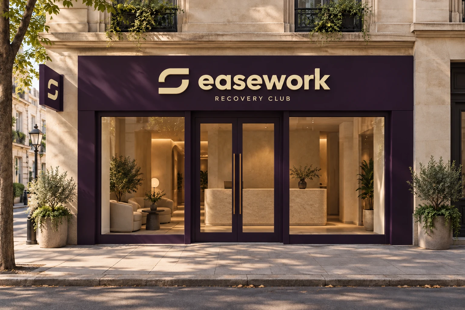
A considered identity for an imagined recovery club. A place to slow down, between the things that move you.
01 — The brief
Give slowing down
a sense of belonging.
Training comes with its own rituals, spaces and communities. We imagined a club that gives the quieter part of an active life the same consideration: time for mobility, warmth and a moment to yourself.
The brief was to make recovery feel welcoming and part of a routine. The identity needed the clarity of a fitness brand and the warmth of a place you would want to spend time.
- For
- People who train and want to make room for slowing down.
- The position
- A recovery club shaped around everyday rituals.
- The promise
- A little space in a full life.
02 — The idea
A name with room in it.

Recovery Club
“Ease” brings the feeling. “Work” connects it to the commitment people already give their training. Together, they frame recovery as something worth making time for.
03 — The identity
Space is part of the mark.
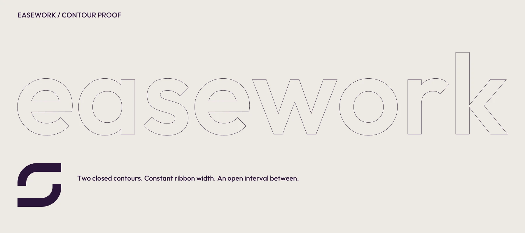
Two turns. One quiet interval.
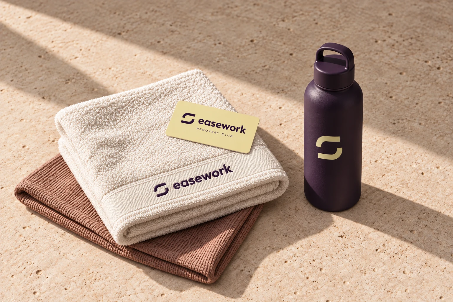
The symbol brings two opposing movements into balance, leaving an uninterrupted space between them. It gives the idea of a pause a recognisable shape. Paired with a quieter lowercase wordmark, it works across a club sign, a membership card and the things you take home.


Recovery Club
Considered down
to the contour.
Clean, closed outlines. A consistent ribbon width in the symbol. Optical spacing in the wordmark. The identity is drawn to work as one colour, in reverse and at everyday sizes.
A warmer kind of energy.
Deep aubergine gives the brand its centre of gravity. Butter, chalk and clay make the world around it feel soft, material and human.
- Aubergine #2B1539
A calm, distinctive anchor.
- Butter #E9E2AC
Warmth and a little optimism.
- Chalk #EEEAE3
Space for the identity to breathe.
- Clay #AE8277
An earthy, tactile accent.
Clear words.
A gentler pace.
The voice is warm, direct and unhurried. Short invitations do the work. Typography moves from spacious statements to practical, readable details.
A statement
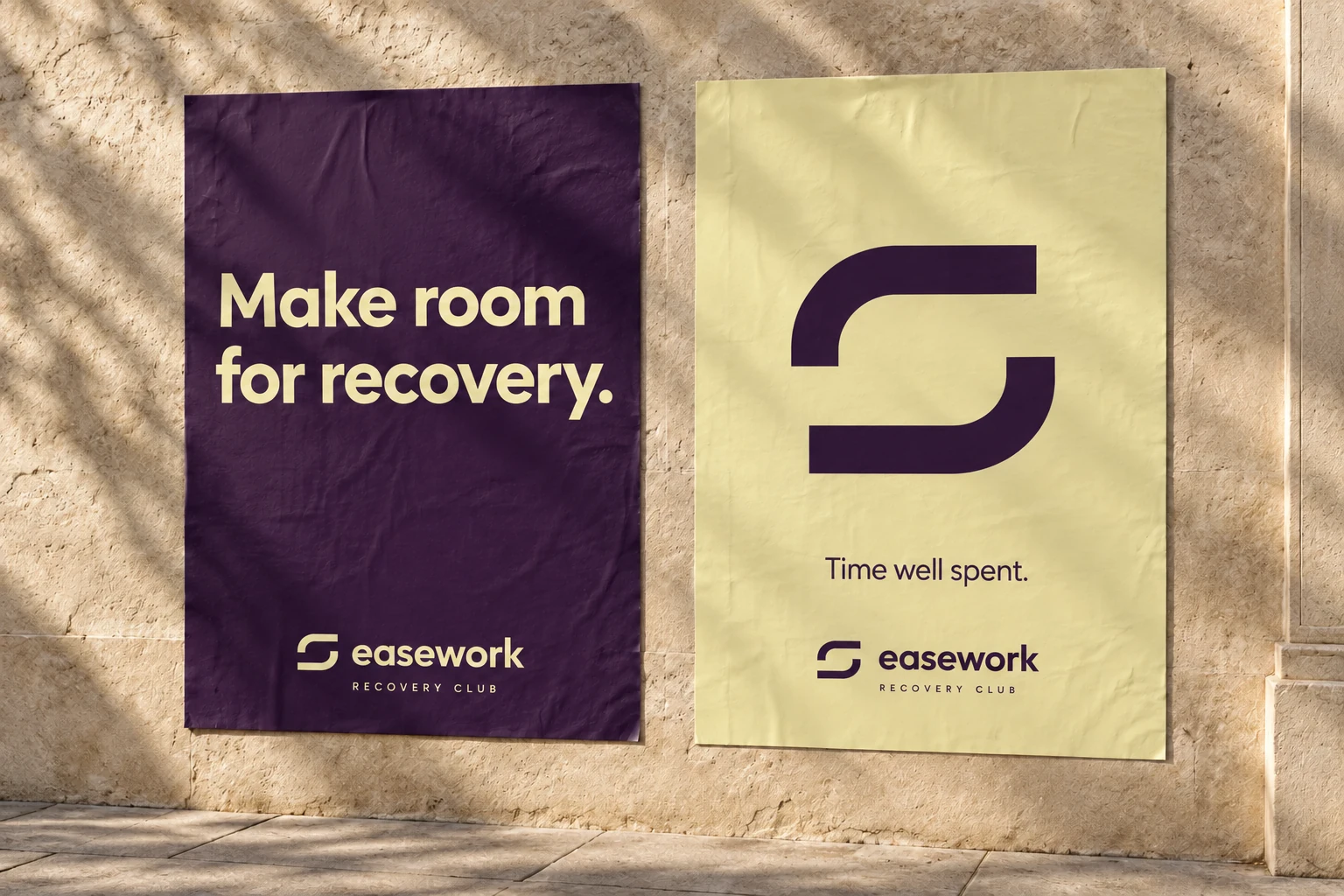
Make room
for recovery.
An invitation
Take your time.
A useful detail
Mobility. Warmth. A moment to yourself.
Brand type: Outfit. Outlined wordmark with optical spacing.
Welcoming
Every line should feel like an invitation into the space.
Grounded
Describe the experience in everyday language. Let the details create the feeling.
Unhurried
Give each message a little breathing room. Keep the next step clear.
04 — In the world
The feeling is
in the details.
A considered entrance, a useful object, a quiet invitation on the street. These imagined applications explore how the identity could make each part of a visit feel connected.
A PulseFit studio exploration
An idea is
only the beginning.
Have a fitness or wellness business with something to say? Let’s find its place in the world.
Tell us what you’re buildingeasework is a self-initiated brand concept by PulseFit. The name, environments and applications are a design exploration, not an operating club or a commissioned client project.