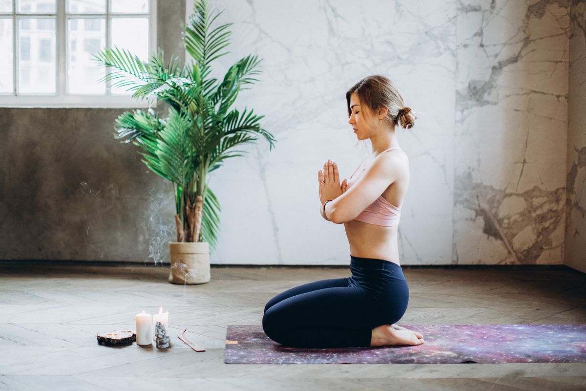
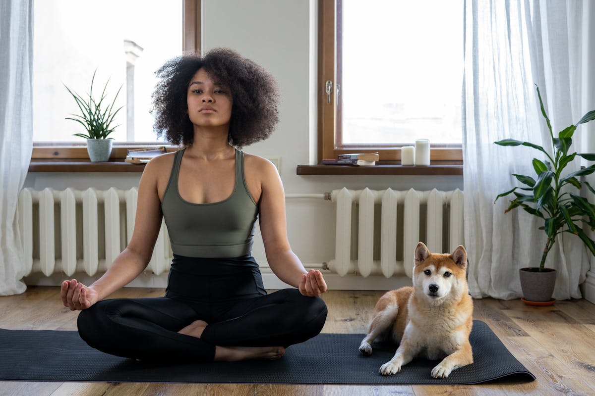
An independent studio communicates its character before a class begins: through its website, booking process, signage and welcome. A coherent brand connects those details with the teaching and experience you offer, so prospective clients can understand what to expect.
Why Independent Studios Need Different Branding
An independent studio is not a chain gym. It is a curated experience, and the branding must reflect that. Traditional gym branding — aggressive fonts, industrial imagery, black-and-red colour palettes — does not work for a reformer Pilates studio in Notting Hill or a breathwork space in Shoreditch. Independent studios need branding that communicates the feeling of the experience, not just the function of the service.
Start with the Feeling
Before any visual work begins, define the emotional territory your brand owns. How do you want clients to feel when they interact with your brand? Energised and challenged? Calm and restored? Empowered and confident? This emotional brief becomes the filter through which every brand decision is made — from the colour palette to the Spotify playlist to the typeface on your booking confirmation email.
Building the Visual Identity
Independent studio visual identities typically lean towards one of two directions: premium-minimal (clean, restrained, lots of white space) or expressive-bold (strong colour, distinctive typography, pattern and texture). Neither is inherently better — the right direction depends on your positioning, audience, and the physical space. What matters is consistency and quality.
- Logo — Should work beautifully at small sizes (app icon, social avatar) and large (signage, merchandise)
- Colour palette — Typically more nuanced than gym branding, with 4-6 colours including warm neutrals
- Typography — Consider readability, personality, and licensing for web and print
- Pattern and texture — Independent brands often use secondary graphic elements to add richness
- Photography direction — Define the style: lifestyle, editorial, documentary, or studio
Environmental Branding
The physical studio is the most important brand touchpoint. Every surface, fixture, and detail either reinforces or undermines your brand. Environmental branding covers signage, wall graphics, wayfinding, reception design, changing room details, retail displays, and even the font on your water bottles. The goal is total immersion — every element should feel intentional and cohesive.
Digital Touchpoints
For most independent studios, the digital experience is the first experience. Your website, Instagram, booking app, and email communications need to be as polished and on-brand as your physical space. This means custom-designed booking confirmations, branded class schedules, on-brand social templates, and a website that conveys the studio experience before someone has set foot inside.
The Member Experience as Brand Expression
Every interaction a member has with your studio is a brand experience. The greeting they receive, the music playing, the cleanliness of the space, the post-class email, the scent in the lobby — all of these are brand touchpoints. The studios that command the highest prices and the strongest loyalty are obsessive about these details because they understand that the brand is the experience, not just the visuals on the wall.
An independent studio brand is not a logo on a wall. It is the total experience a client has from the first Instagram story they see to the way they feel when they leave after class.
PulseFit
Planning an independent studio? See our branding service or read how we built the Radiant Wellness brand from strategy to signage.